

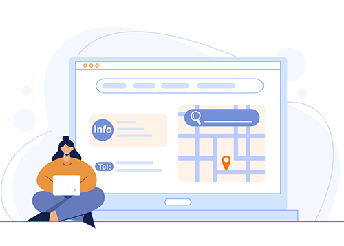
Responsive Web Design: What It Is and Why It Matters
Last updated Sunday, 04/08/2024 15:27 by Lioniel Richard
Learn about responsive web design, an approach that ensures optimal viewing and interaction experiences across various devices, from desktops to mobile phones.
Table Of Content:
What is Responsive Web Design?
Responsive web design is an approach to web development that aims to provide an optimal viewing and interaction experience across a wide range of devices, from desktop computers to mobile phones and tablets. Instead of creating multiple versions of a website for different screen sizes, a responsive website adapts its layout, content, and functionality to the user's device automatically.
How Does Responsive Web Design Work?
Responsive web design relies on a few key technologies:
- Fluid Grids: Instead of fixed-width layouts, responsive websites use fluid grids that adjust proportionally to the screen size. Content is organized within columns and rows that resize dynamically.
- Flexible Images: Images are set to scale down automatically to fit smaller screens without distorting the aspect ratio. This ensures that images remain visible and don't overflow their containers.
- CSS Media Queries: This CSS technique allows developers to apply different styles based on the user's device characteristics, such as screen size, orientation (portrait or landscape), and resolution.
Why is Responsive Web Design Important?
In today's mobile-first world, having a responsive website is crucial for several reasons:
- Improved User Experience: A responsive website provides a seamless and enjoyable browsing experience for all users, regardless of their device. This leads to increased engagement, lower bounce rates, and higher conversion rates.
- Cost-Effective Solution: Building a single responsive website is more cost-effective than creating separate websites for different devices, saving time and resources in the long run.
- SEO Benefits: Google and other search engines favor responsive websites. A single URL makes it easier for search engines to crawl and index your content, improving your search rankings.
- Future-Proofing Your Website: As new devices with varying screen sizes emerge, a responsive design ensures your website remains accessible and functional across all platforms.
Published: 04 August 2024 15:27
RELATED ARTICLES
Understanding Website Mockups: A High-Fidelity Design Essential
Explore the world of website mockups - static, high-fidelity representations of web designs crucial for effective communication, client presentations, and development guidance.

Best Hosting for a Scalable Startup
Your startup just went viral, the traffic is pouring in... and your website just crashed. This nightmare scenario is the direct result of choosing the wrong hosting foundation. Don't let your biggest success become your biggest failure because your infrastructure couldn't keep up.

HTTPS: What It Is and Why It Matters
A deep dive into HTTPS, the secure version of HTTP, explaining its importance for online security, SEO, and user trust.

What is a website?
What is a website? What are the different types of websites? What is the basic structure of a website? Let's find out in this article!

The Future of Web Hosting in 2026 and Beyond
The digital foundation of your business is shifting faster than a server migration, and the hosting solution that works today might be a critical bottleneck tomorrow. The age of simply choosing a plan based on disk space and bandwidth is over; the future is intelligent, decentralized, and green.

The Ultimate Glossary of Web Hosting Terms
All that talk of Apache, cPanel, and VPS can be overwhelming, leaving you unsure if you've chosen the best hosting for your small business. Don't let technical jargon stand between you and a high-performing website.
Best Hosting for a Scalable Startup
Your startup just went viral, the traffic is pouring in... and your website just crashed. This nightmare scenario is the direct result of choosing the wrong hosting foundation. Don't let your biggest success become your biggest failure because your infrastructure couldn't keep up.
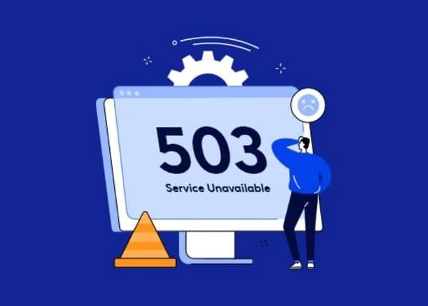
What to Do When Your Hosting Provider Has an Outage
Error 503 Service Unavailable. The words every website owner dreads. Is it a hack? A broken plugin? Or worse, is your hosting provider completely down? That sinking feeling in your stomach is real, but panic is not a strategy. Having a clear, step-by-step plan is the only way to minimize damage and get back online fast.

Top 10 Best Web Hosting Providers for the US Market
Building your own website? Or looking for a new web hosting provider to upgrade your existing website's performance?Look no further! This article will introduce you to the Top 10 best web hosting providers for the US market in 2024, helping you make the most suitable choice for your needs.