

Responsive Design: Adapt to Any Screen
Last updated Saturday, 20/07/2024 03:15 by Lioniel Richard
Learn what responsive design is and why it's crucial in today's mobile-first world. Discover how websites adjust seamlessly to different screen sizes, enhancing user experience and boosting SEO.
Table Of Content:
Responsive Design: A Cornerstone of Modern Web Development

In an era dominated by smartphones, tablets, and various other devices, responsive design has become less of a luxury and more of a necessity. Simply put, it's the practice of building websites that adapt gracefully to any screen size, providing optimal viewing and interaction regardless of the device used.
Why is Responsive Design Important?
- Enhanced User Experience: A responsive website automatically adjusts its layout, text size, and images to fit the user's screen, eliminating the need for awkward zooming and scrolling. This seamless experience keeps visitors engaged and less likely to bounce.
- Improved SEO Performance: Search engines like Google prioritize mobile-friendly websites. Responsive design is a key factor in achieving this, leading to higher rankings and increased organic traffic.
- Cost-Effectiveness: Maintaining a single responsive website is significantly more efficient than building and managing separate desktop and mobile versions.
- Future-Proofing: As new devices with varying screen sizes emerge, a responsive website remains adaptable, ensuring long-term viability.
How Does Responsive Design Work?
Responsive design relies on three core elements of web development:
- Fluid Grids: Instead of fixed-width layouts, responsive designs utilize flexible grids that adjust proportionally to the screen size, ensuring elements flow naturally.
- Flexible Images: Images are coded to resize dynamically, preventing overflow or excessive white space on smaller screens.
- Media Queries: CSS media queries are powerful rules that apply different styles based on the device's screen size, orientation, and resolution, enabling customized layouts for different devices.
Beyond the Basics
While the core principles remain constant, responsive design is an evolving field. Modern approaches incorporate techniques like:
- Mobile-First Design: Starting the design process with the smallest screen size and progressively enhancing for larger screens ensures an optimal mobile experience.
- Content Prioritization: Identifying and prioritizing essential content for different devices ensures users see the most relevant information first.
By embracing responsive design principles, businesses and developers can create user-friendly, search engine-optimized websites that cater to a diverse audience in today's multi-device world.
Published: 15 July 2024 03:53
RELATED ARTICLES
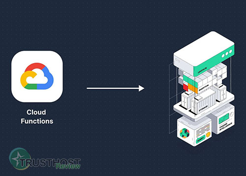
Google Cloud Functions: A Deep Dive into Serverless Computing on GCP
Explore Google Cloud Functions, a serverless platform for building and deploying event-driven applications. Learn how it works, its benefits, use cases, and best practices.

Website Bandwidth: What It Is and Why It Matters
Learn about website bandwidth, its impact on website speed and performance, and how to choose the right hosting plan for your needs.

SQL Injection: A Guide to Understanding and Preventing This Common Web Vulnerability
Learn about SQL injection, a code injection technique used to attack websites. Understand how it works, its impact, and crucial prevention measures to protect your web applications.

Best Cheap Web Hosting: Top 5 Providers That Don't Compromise on Quality
Is your wallet screaming every time you look at web hosting prices? You're told you need to pay a premium for a fast, secure website, but what if that's not the whole story? We're here to prove that 'cheap web hosting' doesn't have to be a four-letter word for 'slow and unreliable'.

The Future of Web Hosting in 2026 and Beyond
The digital foundation of your business is shifting faster than a server migration, and the hosting solution that works today might be a critical bottleneck tomorrow. The age of simply choosing a plan based on disk space and bandwidth is over; the future is intelligent, decentralized, and green.

The Ultimate Glossary of Web Hosting Terms
All that talk of Apache, cPanel, and VPS can be overwhelming, leaving you unsure if you've chosen the best hosting for your small business. Don't let technical jargon stand between you and a high-performing website.

Best Hosting for a Scalable Startup
Your startup just went viral, the traffic is pouring in... and your website just crashed. This nightmare scenario is the direct result of choosing the wrong hosting foundation. Don't let your biggest success become your biggest failure because your infrastructure couldn't keep up.

What to Do When Your Hosting Provider Has an Outage
Error 503 Service Unavailable. The words every website owner dreads. Is it a hack? A broken plugin? Or worse, is your hosting provider completely down? That sinking feeling in your stomach is real, but panic is not a strategy. Having a clear, step-by-step plan is the only way to minimize damage and get back online fast.

Top 10 Best Web Hosting Providers for the US Market
Building your own website? Or looking for a new web hosting provider to upgrade your existing website's performance?Look no further! This article will introduce you to the Top 10 best web hosting providers for the US market in 2024, helping you make the most suitable choice for your needs.